Sketchy mocks
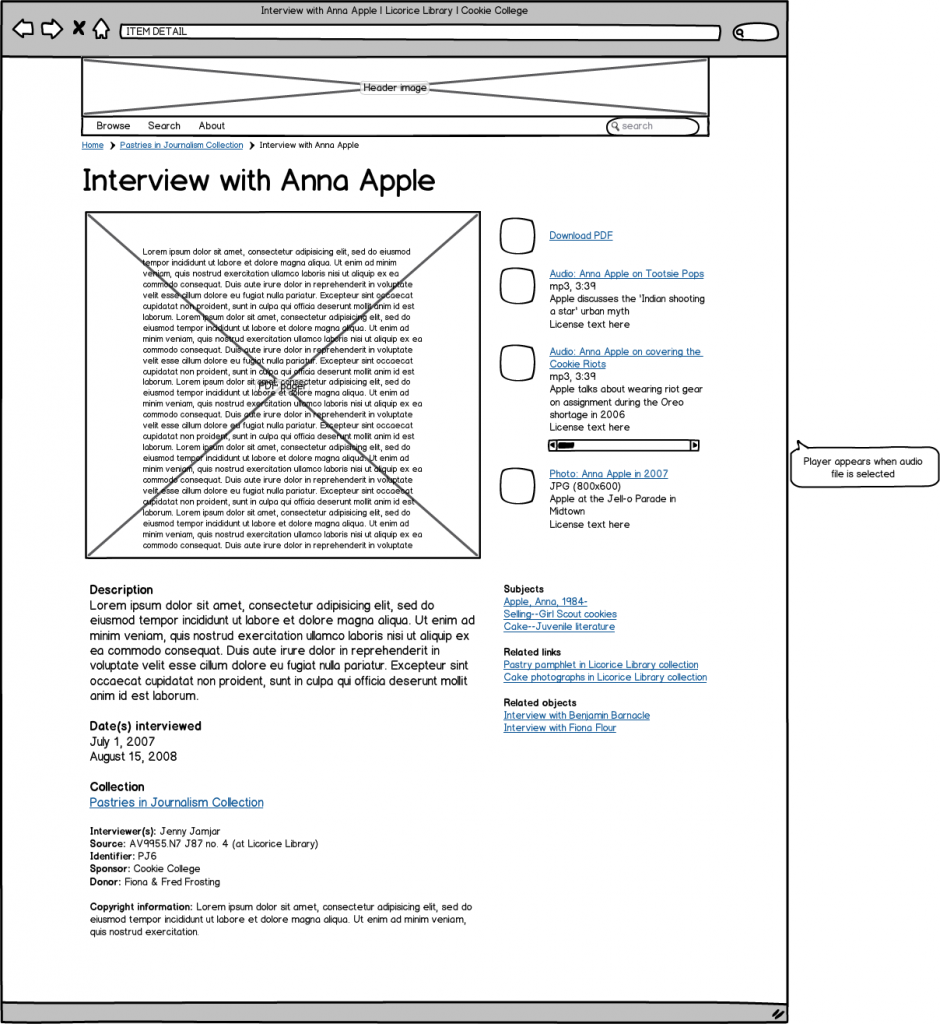
In designing the new Lloyd Sealy Library website, I used Balsamiq, a sketchy wireframing tool, to plan page layouts, information architecture, and user flows. I like the sketchiness particularly. Too often, group-approved design gets bogged down in colors and fonts, but charmingly drawn mocks like these free your conversations from the details so you can focus on the important elements of user experience.
Here's a real mock I used to design a page on a forthcoming project (click for larger):
I use the desktop software ($79), but there's also a cloud-based web app ($12+/mo), which is amazingly well done. There are some very nice touches, like the kinds of items you can drag 'n' drop to create your mock, the auto-filltext that appears when you type 'Lorem,' and the 'What should I make for dinner?' option in the Help menu (really). It's not the speediest tool, but I have found that added friction allows time for you to really consider what you're designing. Perhaps William Morris phrased it best: "You can't have art without resistance in the materials."
Related reading: Bethany Nowviskie, "Resistance in the Materials" (2013)
