Using Twine for non-linear tutorials

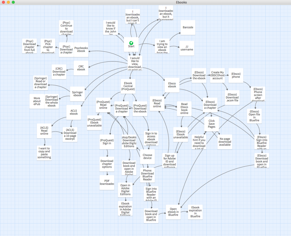
Bird's eye view of my ebooks tutorial
I was first introduced to Twine through Birdland, a delightfully weird bit of e-lit. Its engine, Twine, is designed specially for interactive, nonlinear stories (the choose-your-own-adventure kind).
Turns out Twine is useful for non-literary purposes, too. For some tutorials, it doesn't make sense to use a linear structure, so Twine is a great tool. Examples of library-related Twine tutorials: choosing a reference manager or how to use the library.
In the library where I work, we get a lot of questions about using ebooks. These questions often come by phone, email, or chat. Patrons are (rightly) frustrated about the overly complicated process to download ebooks. On the phone, reference help usually begins with something like, "Are you seeing the word 'Ebsco' in the upper left-hand corner?" But patrons shouldn't have to learn all about our ebook vendors just to do their reading! Even librarians feel a headache coming on trying to diagnose ebook problems and remember which vendors require an Adobe ID login (ugh). So...
Enter a Twine tutorial about using ebooks!
I found Twine to be a great fit for this, since patrons are dealing with ebooks from different vendors, want to do different things with them, and encounter different problems. From a UX point of view, breaking up a tutorial into click-through steps is so much better than presenting users with a wall of text and expecting them to skim through it to figure out what specifically they need to read.

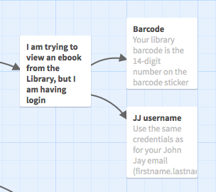
View within Twine
The only downside was that I got way too into it and included multiple tasks' instructions for all of our ebook vendors. It probably took me 10 hours to make this tutorial. Like any web object, it will also require maintenance as time goes on, e.g., updating screenshots when ebook vendors' UIs change.
I used the downloadable Twine 2 app rather than the web app, so that I didn't have to worry about accidentally losing my work if I cleared my browser cache. Both output lightweight HTML files with included JavaScript and CSS. (This is especially nice because all the code is bundled into one small file — no need to worry about external JavaScript libraries.)
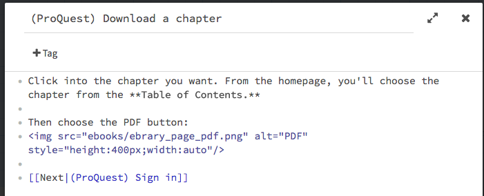
It's easy and intuitive to get started, especially if you're already familiar with markup standards like Wiki or Markdown. It also accepts HTML, so you can make external links and include images using HTML tags.

Harlowe and HTML markup example
Once your tutorial is in a "done" state, just upload the resulting HTML file and any images you used to your webspace.
Note: By default, the page background is black and the text is white, which is hard to read (and not accessible), so if you know a bit of CSS, you can add a custom stylesheet. To change the look of everything, add something like this: tw-story { background:#fff; color:#000; ... }.
I can see this particular ebooks tutorial being used as a tool for both patrons and librarians. The feedback from my colleagues has been very positive so far, and we're already talking about what other topics could be explained with this kind of non-linear instructional material.