What does a UX librarian do?
A library & information science (LIS) student recently contacted me to ask how I came to be a User Experience (UX) Librarian at NC State University Libraries, where I’ve worked in the User Experience department since summer 2019. I’ve adapted their thoughtful questions and my replies for this blog post, which was written with LIS students and job hunters in mind.
Every UX librarian’s job is different. There are a lot of facets to UX, and UX librarians will take on different skill sets depending on the context of their institution and where user needs are. I’m not even the only UX librarian at NC State — the head and associate head of our 6-person department are also librarians, and their jobs are different from mine. Additionally, some librarians’ jobs are very much about UX but might be called something different, like Web Services Librarian, and might include other focuses, too, like library systems and student outreach.
As for me, though, my job as a UX librarian can be summed up in two parts: content strategy and user research. But I’m getting ahead of myself.
What was your path to becoming a User Experience Librarian?
I got my MLIS in 2012 from the University of Illinois Urbana–Champaign, then worked for seven years at John Jay College of Criminal Justice (a CUNY college) as the Emerging Technologies & Online Learning Librarian. In that role, I designed & maintained the library’s website, along with a wonderful systems admin and a talented part-time web developer, and in collaboration with a small staff of full-time and adjunct librarians. Being part of a smaller department meant that I wore many hats — reference, instruction, discovery, student outreach, web development, user experience. This was a fantastic way to cut my teeth and learn how an academic library really works, something that’s hard to truly understand in school. CUNY was a great place to be a librarian, and it’s been wonderful (and challenging) to work at a larger library at NC State. Now that I’m part of a bigger staff and have a more focused role, I can really zero in on the work I like best: user research and UX!
I love the “change stuff and see what happens” part of working in UX — because we work on the web, we can make changes iteratively, working toward a better product.
I wrote a post in 2012 about my MLIS coursework and first job hunt. Last year, I wrote about my new job as User Experience Librarian and the workplace transition.
What kinds of things do you work on as a UX Librarian?
User research

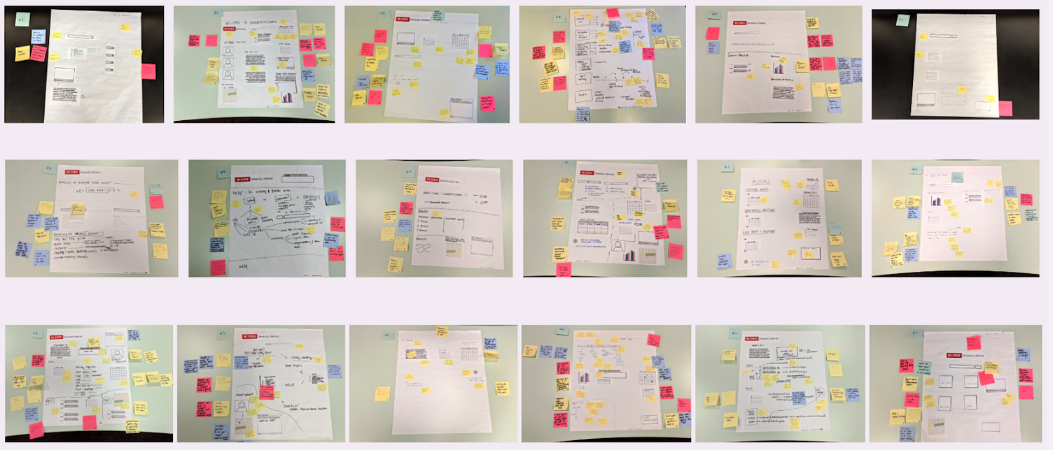
Photos from participatory paper prototyping
I do a lot of user research. In Fall 2019, I was on a team that conducted user research via interviews and participatory paper prototyping (here’s a slide deck for a presentation I gave on it recently). Our main research question: What is the research workflow for participants’ academic projects? Our aim was to get a full view of their research workflows in support of a more focused project to connect siloed library services. This user research was both fun and insightful, my fave combo! As my first big user research project at NC State, it was a great way for me to get to know what students’ academic lives are like.
Also in the realm of user research, I’ve been inducted into the Tiny Café user research series at NC State, which was kickstarted by my talented colleague Alexa Carter. I had done some similar work before, implementing lightning usability testing at John Jay; others call it guerilla usability testing. Any way you name it, it’s an awesome way to get feedback from 15+ people for one or two focused research questions over the course of 2–3 hours without a lot of overhead. Research questions for Tiny Café can range from “How do users find ebooks?” to “What are students’ impressions of the renovation currently underway?”
We’re starting to plan remote usability testing for summer and fall 2020, during this time of social distancing. What this might look like: we ask 5 participants to share their screen with us over Zoom for 30–60 minutes each. We might ask them, “How would you find a quiet space to study before going to the library? Try to find this on the Libraries website.” or “Imagine a scenario where you’re looking to book a group study room. How would you go about doing this?” Usability testing is a great way to observe how users navigate your website or app and what roadblocks they counter.
Content strategy

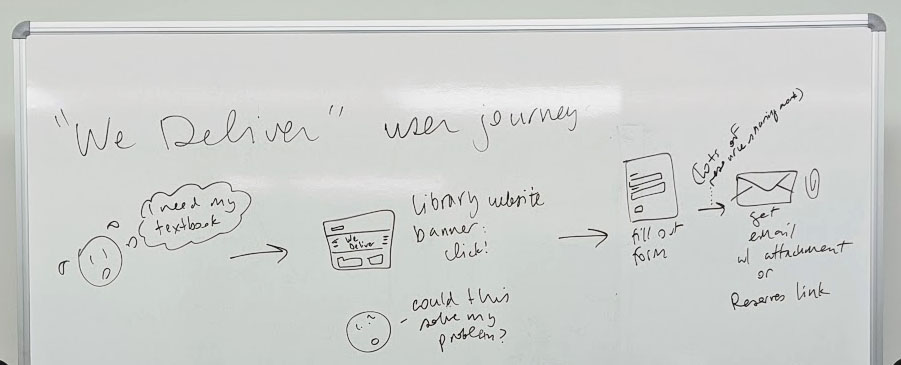
Photo from a whiteboarding session about the user's journey through getting a textbook chapter scanned
Another big part of my job is content strategy: writing, editing, organizing, and evaluating content on the website. The whiteboarding photo above is from a brainstorming session about a user journey. It includes the user’s emotional state as well as the steps the user takes in trying to accomplish a task, moving from one part of our website to the next.
We’re continually working toward empathy with our users (in other words, putting ourselves in their shoes and thinking about the tasks they’re trying to do). There’s a great book called Writing is Designing that dives deep into things like adjusting the tone of error messages. Should a given error message be more informative or more sympathetic, in the context of its place in the user’s journey? Even small textual changes can make a real difference in a user’s experience with the library — and, by extension, their experience doing coursework or research.
In the UX department, we talk often about stress cases, which I first learned about in a book called Design for Real Life. Rather than ignore “edge cases” and think only of the “average” user, we should think about how our website performs for a user in an unusual state of stress or urgency. Users who are stressed (or sleepy, or in a rush, or have anxiety, or have dyslexia, …) already have a heavy cognitive load while using your site, so the content should not add to that it by being difficult to skim or hard to understand. We aim to use plain language elegantly and to structure our web pages in a way that makes it easy to get the gist quickly.

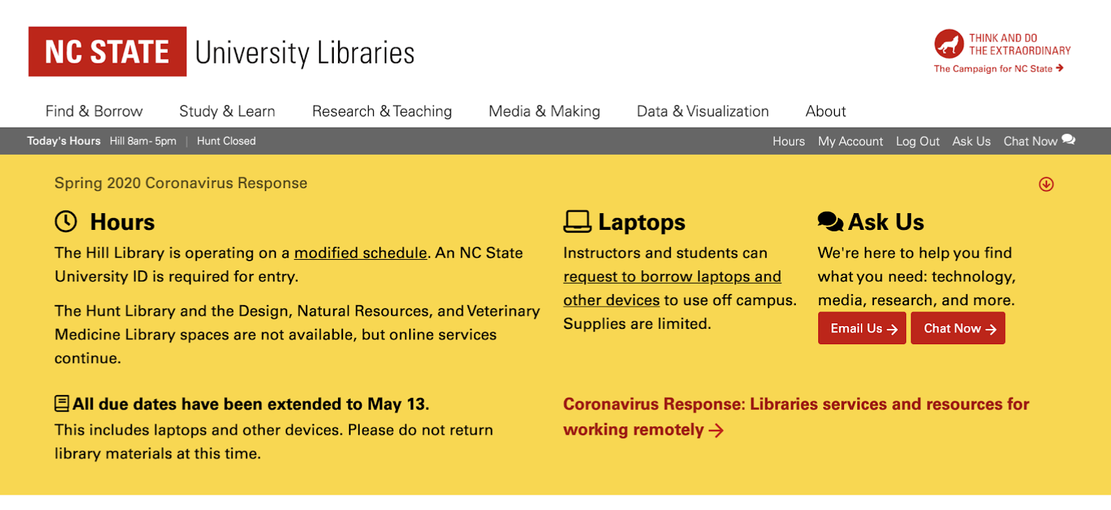
Considering stressed users is especially important in this moment! I designed an alert banner on our homepage (above and captured in the Internet Archive, March 25) and am actively collaborating with my colleagues on our Coronavirus Response page (IA capture, March 26), which sums up service changes across the library. These alerts build on our experience with weather notices and network outages, but the exciting thing to me has been gracefully incorporating the information into the rest of the website over the course of the semester and into the summer. This exercise in getting information to stressed users has been challenging and really instructive.
How would you compare UX in industry vs. UX in an academic library?
I’ve never worked in UX outside of academic libraries, so I can’t speak from experience as I compare the two realms. But as part of my professional development, I’ve been a part of meetups and classes with folks who work in industry, and I can tell that the pace and mission are different. The pace of work is slower in academic libraries, because we don’t like to “move fast and break things” — we aim to be careful and thoughtful. The mission is different, too. Our end goal is student success as well as exemplary scholarship on our part, rather than making sales or gaining an edge over competition. Working at a public instutition of higher education is rewarding for me in this regard.
What are some good conferences & reading materials for library UX practitioners?
Designing for Digital is great. I recently attended and came away with lots of ideas and to-dos. Every session was focused in some form on UX in libraries — it was totally refreshing to be at a conference that targeted this somewhat niche part of our profession.
I’ve also attended and enjoyed Code4Lib; edUi (no longer offered, RIP); and UX Y’all, a local-ish conference for UX professionals in Durham, NC. Big library conferences, like ACRL, sometimes have UX-y sessions or tracks, too.
Reading materials
Weave: Journal of Library User Experience — a must-read for library UX practitioners!
Nielsen Norman Group — NN/g is a huge influence in the UX industry. They do a lot of user research. Two recent-ish articles, How People Read Online and Scrolling and Attention, are particularly interesting
UX Collective newsletter — a handful of fun links every week; leans quite designer-y
A List Apart website — great to poke around, especially the articles about writing
What’s next in libraries & UX?
Web accessibility is becoming a much more widespread focus at library conferences, workshops, discussions within the profession. It’s always been important, of course! But since the recent spate of accessibility lawsuits, college administrators have directed more resources toward web accessibility across their campuses, and while the focus on web accessibility began at the “CYA” level, it’s finally becoming part of the conventional UX process in academic libraries big and small. While accessibility awareness has always been high at some institutions, it’s becoming more common across the board.
The next tier of web accessibility is ensuring that websites are accessible to and inclusive of neurodivergent users. That was new to me until last year, when I saw a great presentation on design considerations for neurodiverse users. That’s something exciting that we’re starting to work on at NC State, and I think we’ll see some emerging best practices in that area.
I love being a UX librarian! It’s my dream job. If you’re a library & information science student who’s considering this career path, I’m more than happy to chat — just email me.