Designing for stressed-out users
Over the past eleven months of the pandemic, I’ve thought about how to design content for stressed-out users (and we’re all stressed-out users). Here’s the deal with users under stress:
- Their cognitive load is already heavy
- They can’t take in as much new information
- They’re usually skimming instead of reading closely
As a librarian who’s managing a “What to expect at the Libraries” page, this is what I keep in mind. So if, like me, you’re writing or designing content about processes or protocols that affect your users’ lives, you will want to tailor your content for stressed-out users.
Make it easy to skim
- Use plain language.
- Write in short paragraphs or use bullet points whenever possible.
- Use frequent, bold headings, like I’ve done in this blog post.
- Avoid 4+ nouns in a row. (Bad example: Library Coronavirus Response Resources.)
Use a calm tone
- Don’t let your stress leak into your writing.
- Do not use all caps for alerts. (Bad example: ATTENTION.) They are harder to read quickly and add to users’ cognitive loads.
Be concise and straightforward
- Announcements should be in plain language, not overly policy-y. As you write them, read it aloud and see if it sounds stilted or natural.
- Front-load your announcements: the things users need to know come first.
- Are you closed? Say you’re “closed,” not “not available.” (At most, “not open,” if management won’t budge on the word “closed” for some reason.)
- Don’t be too cheery or cute in announcements or functional writing; it may come off as offensive to a user in stress.
…Except when detail is warranted
- Your announcements are concise, but you can also provide detailed information for high-stress scenarios where not knowing what to expect causes stress. This info belongs in FAQs or following a “More info” link.
- During a pandemic, be descriptive about what to expect when a user goes somewhere in person.
Good examples:
- Wake County Library’s Books On The Go page. They provide a step-by-step answer to “How to use the Books on the Go Service?” and a video that illustrates the process visually.
- Duke University Library’s “Library Takeout” Video. Okay, so this is pretty cheery and cute, but it works, and it really does walk the viewer through the steps of the process — include “waaaait,” something that’s hard to convey positively.
“Last updated” dates
- Pages that are updated with timely information should have an “Updated [date]” blurb at the top or bottom.
- This is especially important at the start of a semester or when your city moves into a new phase of lockdown.
You might notice that most of these rules of thumb aren’t just for designing for stress. They’re good rules for web content in general. But following these conventions matters even more for users in stressful situations.
An example of designing for stressed-out users
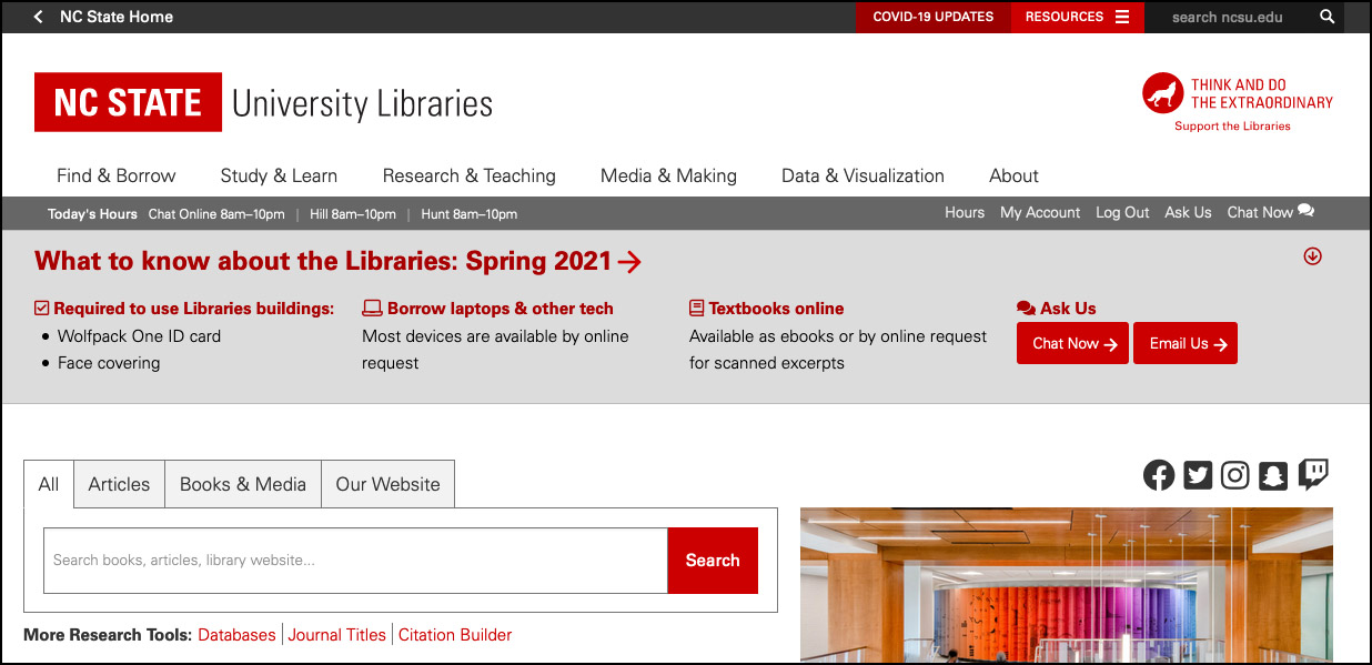
At my workplace, NC State University Libraries, I’ve been part of a small team that has honed timely messaging for our website during the pandemic. Part of my contribution is design and layout of this messaging. Here’s what the top of our homepage looks like right now:

The contents of the banner include only the biggest changes to using the Libraries. Even though these changes were in effect in Fall 2020, we knew that some students’ first time in library buildings this academic year would be in Spring 2021.
Each heading links to more detailed information. We’re using icons alongside headings to help visual learners (like me) skim visually.
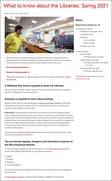
And here’s what that “What to know” link leads to:

This is a cropped screenshot, and probably not super legible, but you get the gist of the layout. (View Internet Archive capture.)
I’m proud of this collaborative work. Our messaging format has evolved over the months, and our current product is in pretty good shape.
Reflecting on stress cases
One of my primary frames for thinking about my work in UX has been the stress case — the user that is on the website in a moment of crisis. You might not think of crises happening often in an academic library, but they do, and as Eric Meyer and Sarah Wachter-Boettcher put it in Designing for Real Life:
…We often hear, “We’re designing for the 90%, not the 10%.” That’s classic edge-case thinking: a shorter way of saying, “That’s a difficult case that I don’t want to think about.” … If someone comes to a site or app in a moment of crisis, we bet they have a genuine need to be there — and that is the exact moment we don’t want to let them down. (pp. 42–46)
The authors advocate a stress-first approach to design (playing off of mobile-first).
Before March 2020, my go-to example of a library website user in crisis was a student whose paper was due in two hours for a course in which they were struggling, and for which they needed a passing grade to graduate on time. This user may not be typical but does exist, and our website should be at its best for this stress case.
But since March 2020, I’ve begun to think of the typical user as a stress case. The ongoing pandemic, the grief from the pandemic, George Floyd’s murder, the economic crisis, the election, the Capitol Riot — these events caused or continue to cause everybody a lot of stress. A compassionate approach to UX accounts for this stress.
I don’t know if things will ever go “back to normal.” But I know that this frame, designing for the stress case, will always be a part of my approach to UX work.